BTW, I would like to say something about Preacher's work from my perspective.
Anyway...it is a very good work...it would be great as a DVD cover...but it need some more work. I have 3. problems with that poster/cover.
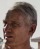
1. As I said before...picture of Dolph is "unofficial"...to bad. OK, that its not that big problem, but IMO, that "different hair style" somehow spoils the concept of the poster because it looks like poster it was made from images from another movie ... like cover for the Direct Contact where they use image from The Mechanic. Although...is great poster picture...very cool!
2. Title could use some work...I dunno, but somehow look to simple...something is missing there...but I'm not sure what for now.
3. There is to much going on poster, around Dolph...its just to crowded (I would remove some pictures and focus more on Dolph)...and its kind of "to colorful"...to modern...it remind me on Fast and Furious posters...
But after all...as I said its a very good work... with a little more work, could be wonderful poster/cover
Hey Dragonrage and thanks for the feedback!
You are right ofcourse about the hairstyle in the pic. I did'nt notice it until you pointed it out though. My main problem with that particular pic is not Dolphs look but the fact that the focus is on the gun and not his face.
I agree in full about the title. I wanted to use 3d studio max all along but I have must have uninstalled it or something. It's works better in my last version i think.
The colors are of course a consious choice. I wanted the poster to be glossy and shiny and looking at it I kinda like the look. BUT the choice of COLD colors are kinda modern (like fast and furious). Maybe that was not the best choice...
I kinda like the crowded feel. I think the fact that Dolphs face is out of focus makes the backround stand out a bit to much right now though.
I don't think i will spend anymore time on this poster but I had a blast making it so I might just make another one in the future.
Now... my thoughts on your work.
The look and concept of all the posters are great. Good layout and balance.
My problem is: The pictures are not that great.
I know there are not that many to choose from, especially not on Dolph.
Keep the fan art coming everybody!
It's inspiring and fun to talk about.
Oh... and sorry about the long post.